For starters, I wanna say I am so happy we are finally here at this point to be considering the movie poster!
For fonts, I decided to match them as close or exactly to the fonts that are present in the movie trailer. This helps create a brand consistency.
(AMATIC SC and SACRAMENTO)
For the photo, I used a shot from the most meaningful moment within the film. This is an extremely significant moment for the main character which is why I thought it would be a good marker for the film to be remembered by.
For editing, I did the same type of editing that I used throughout the trailers which is higher contrast and higher brightness. I want everything to be casual and calm. This is the brand so it would be important to stay consistent within the trailer.
For the tagline, here are some options that I am going back and forth between:
She took her fate into her own hands.
Where some would give us she preserved.
For the love of dance.
I can't wait to disclose with you guys my final poster!
Looking forward to it,
Lina
Subscribe to:
Post Comments (Atom)
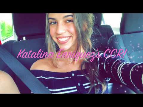
Creative Critical Reflection
Thank you guys so much for sticking around during my process, here is a video reflecting on it all and giving some additional insights. Th...
-
 As we all know, being quarantined has thrown a knife into all of our backs and made it very difficult to continue the creative process. Toda...
 -
It is final, reflective, comments time everybody. This is pretty emotional for me because of a lot of different things. First, this proj...
-
Thank you guys so much for sticking around during my process, here is a video reflecting on it all and giving some additional insights. Th...

No comments:
Post a Comment